Paint colors range from rich and delicious, to bright and beautiful. Fall is my favorite season the cooler weather, and incredible colors! The colors in nature relate well for indoor spaces. Bold reds, orange’s, gold’s, yellows, rich browns, and greens.
Color forecasts some years use rich tones and other years cooler tones. This time of year, we enjoy eyeing rooms with rich tones because they feel warm. Although some of these colors may not be your favorites; ones that you tend to gravitate to. If they are not, consider different hues and values, as they may complement your spaces better.
Oranges can range from bright to subtle. If you feel a bright color is too shocking maybe look at one that is more muted. The key to working with these colors in a room is to balance them with existing components in the room such as the flooring, woodwork, and furnishings you have. Using neutral colors to complement their boldness completes the look for a room.
This Year’s Trending Colors
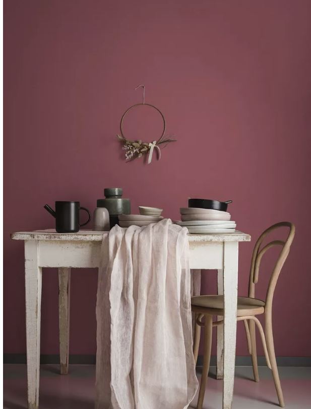
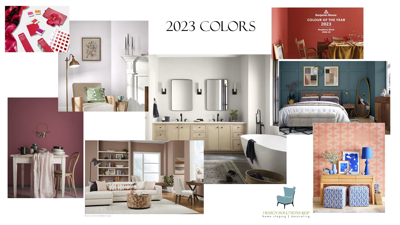
Dunn Edwards chose Terra Rosa pictured below. it is an approachable hue with rosy, pink undertones and a touch of terra cotta. The warmer color a little bit on the brown spectrum creates a felling of warmth and joy in a room.
Other manufactures of paint are choosing happy, energetic colors for the home. Sherwin Williams chose Redend Point for 2023. It’s considered an intriguing, calming, minimal color. While Benjamin Moore Raspberry Blush, again a very energetic happy color. As the describe it … “a saturated red-orange that enlivens our surroundings while awakening our senses with charismatic color. This vivacious color is unapologetic in its boldness as it encourages a confident color statement.”
Pantone’s Viva Magenta color of the Year is “powerful and empowering. It is a new animated red that revels in pure joy, encouraging experimentation and self-expression without restraint, an electrifying, and a boundaryless shade that is manifesting as a stand-out statement.”
As you can see color is to bring excitement and a positive feeling to everyone’s home in 2023.
Valspar choose a more subdued color, Gentle Violet. It pairs well with some of the bolder colors that other manufactures have chosen.
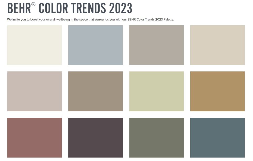
These colors are from Behr paints. Notice how they are softer shades of colors. The colors are to evoke a feeling of wellbeing. Blank Canvas is their selected color of the year.
Still not convinced you can decorate with warm, exuberant colors? Try using this color combination when setting a table for company. Possibly using some in a simple tablescape will allow you to see how they can translate to decorating a room. Maybe add just a pillow or two in your room to give it an updated look. You will be able to see how they work with one another, and hopefully, give you some inspiration to try in a room or two.

