When it’s time to paint a room, do you agonize over which color will work? Have you painted a room you chose from a chip and thought “this will be it!”; only to find it is not the one? Paint color can be tricky but it does not have to be.
There are many blogs, websites, and tons of information on color, but they are typically just that, information on color. When it comes to finding the right paint color it can be tricky because there are so many elements in the room to consider. All elements need to be considered, they will have undertones that can affect the look of the paint color in a room.
A great example:
When I first moved into my house I chose fabric for drapes in my dining room because I liked it. Similarly, I found a wallpaper that I thought would look lovely giving me that beautiful airy tone-on-tone look I was trying to achieve. Lo and behold once the room was completed it was OK but not “quite right.” Yes, everyone “loves” the room but something was off.
One day my daughter said “Mom, I think the drapes are faded or something,” they looked dirty compared to the wallpaper! When choosing fabric for the drapes and the wallpaper they looked ok together from the samples I had, but the beige was “not quite” right. That’s when I discovered it’s all about the undertones.
The yellow/beige in the drapes were not working with the pink/beige in the wallpaper. The two undertones made everything in the room look dirty. Needless to say, it became a huge project (info for another blog) to remove the wallpaper and paint to make everything work together; an expense I could have avoided if I only knew then what I know now!
The complexity of color
Color is complex, no wonder so many deliberate over which color to choose in their homes. Without understanding how colors can affect one another, as well as the light in the room and the direction the room is facing, the wrong color can be chosen. Understanding how and why a color may look in a room is challenging!
When creating a color palette for a room there are many factors that need to be taken into consideration. Although the colors may not be next to each other it is important to view the characteristics of all the elements to understand how they will or will not work together.
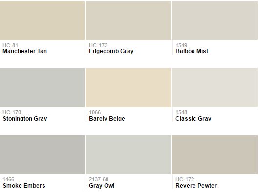
I now can easily distinguish the difference in colors. Consider all the elements in the room. Distinguish which undertones are prominent. Also if the color is on the warm or cool side of the spectrum, muddy or clean. Once you determine these elements and then you can start to eliminate some colors to consider others. I truly believe either you are born with this instinct, you need to learn it, or you hire someone that can do this for you.
Before understanding how colors work with one another, I did get the color correct but never considered knowing why. Through extensive training and classes, I have learned why. Now when I have a client say “but I really love this color, can’t I use it instead?” Understanding color is not easy. I see why so many people deliberate over choosing colors. You do not want something that is “not-quite-right-look” in any room in your home. Choosing the right color, although it may not be your favorite, will bring all the elements in a room together.
Other posts you might enjoy:


Join the discussion 2 Comments